
Developing a brand identity for an HR company committed to increasing diversity in the workforce

Introduction & Overview
Choosing the right people is one of the most important decisions an organization can make. But, how do you make sure your selection process is fair, equitable and non-bias? This is the problem GAN Human Resources solves, specifically for apprenticeship programs.
Hiring coordinators at trade associations are stressed and overworked which means they often don’t have the time to ensure their hiring processes meet all legal requirements. GAN’s unique selection method and research-backed aptitude test offers a solution – one that guarantees applicants are being measured objectively. This gives organizations the confidence they need to hire excellent workers from diverse backgrounds.
Approach
Amanda Neuman, consultant at GAN, came to me in Fall of 2022 with a desire to completely refresh the GAN Human Resources brand. Her goal was to develop a new system that matched GAN’s level of expertise. The current brand had become stale and dated. With new partnerships on the horizon it was an excellent opportunity to introduce a new identity and update marketing materials. I took Amanda through my discovery process in order to establish strong foundational knowledge of the company and develop thoughtful creative for the next era of GAN.

The Brand
As we were discussing the brand, Amanda made it clear that the methods GAN uses are backed by data. With extensive knowledge and research in the field of Industrial/Organizational Psychology, it was important to convey this concept visually within the brand.
With this in mind, I developed a simple wordmark that incorporates the concept of data, research and analysis directly in the logo itself. Transforming the “N” into a bar graph further emphasizes GAN’s focus on research-based solutions. This way, whenever prospective customers interact with the GAN brand, they immediately start making these associations.
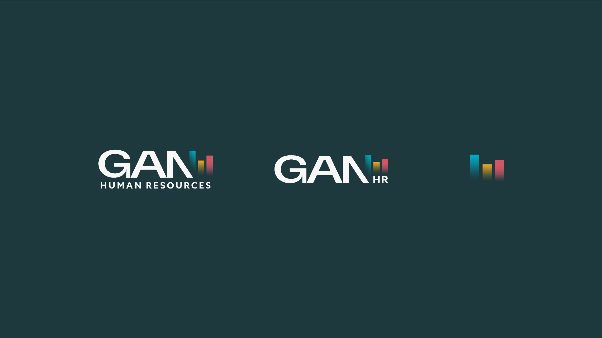

Color was another important consideration. The previous brand utilized a very small color palette which limited expression in marketing collateral. By extending the range of colors, we created a whole new look and feel, making GAN’s message come through more clearly and effectively.

Building out the Brand
Beyond the logo itself, I provided GAN with a 20+ page brand style guide as a reference for all things brand and marketing. Everything from correct logo usage to specific color codes to typographic hierarchy is included in the guide. I also stepped out a variety of marketing collateral to jumpstart the brand evolution including business cards, an 8-page marketing brochure, a templated presentation deck, social media graphics and more.


Conclusion
Overall, I am very pleased with the result of our collaboration. Amanda is highly knowledgeable and dedicated to the field of I/O Psychology. I’m grateful to have worked on a project with a team I know is passionate about building better opportunities for workers in the trades.

Client Testimonial
"Throughout the entire process, Kelsey was responsive, communicative, and transparent. She kept us informed every step of the way and was always available to answer any questions or concerns that we had.
In the end, we couldn't be happier with the results. Thanks to the exceptional work of Kelsey, we now have a brand identity that stands out from the competition and truly resonates with our target audience. Overall, I highly recommend Kelsey to anyone looking for expert branding solutions. Her professionalism, expertise, and creativity are second to none. "
Amanda Neuman, Consultant